

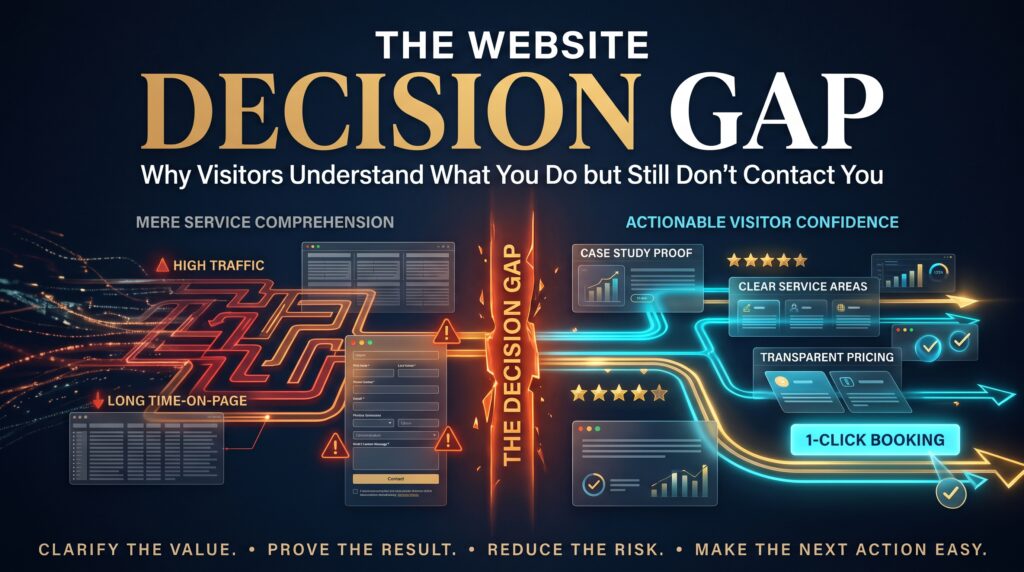
The website decision gap is the space between a visitor understanding what your business does and actually choosing to get in touch. They read your homepage, they get it, they may even nod along. Then they close the tab. Your analytics shows healthy traffic, your messaging seems clear, and yet the phone stays quiet and the enquiry form stays empty.
This guide explains why the website decision gap exists, how to spot it on your own site, and the practical changes that help hesitant visitors take the next step. It is written for business owners, marketers and anyone who has asked, “Why is our website not generating enquiries?”
What Is the Website Decision Gap?
Many websites are built to explain. They describe services, list features and show a few photos. But understanding is only the first step. A visitor also needs to feel confident, see a safe and easy next move, and believe that contacting you is worth the effort. The website decision gap is what is left when a site explains well but does not help people decide.
This matters because it is a different problem from low traffic or unclear messaging. Visitors are arriving and they understand you. Something between “I get it” and “I will contact them” is blocking the way, and fixing it usually raises results more than buying more traffic.
Why the Website Decision Gap Happens
Visitors hesitate for ordinary, human reasons. The most common ones are:
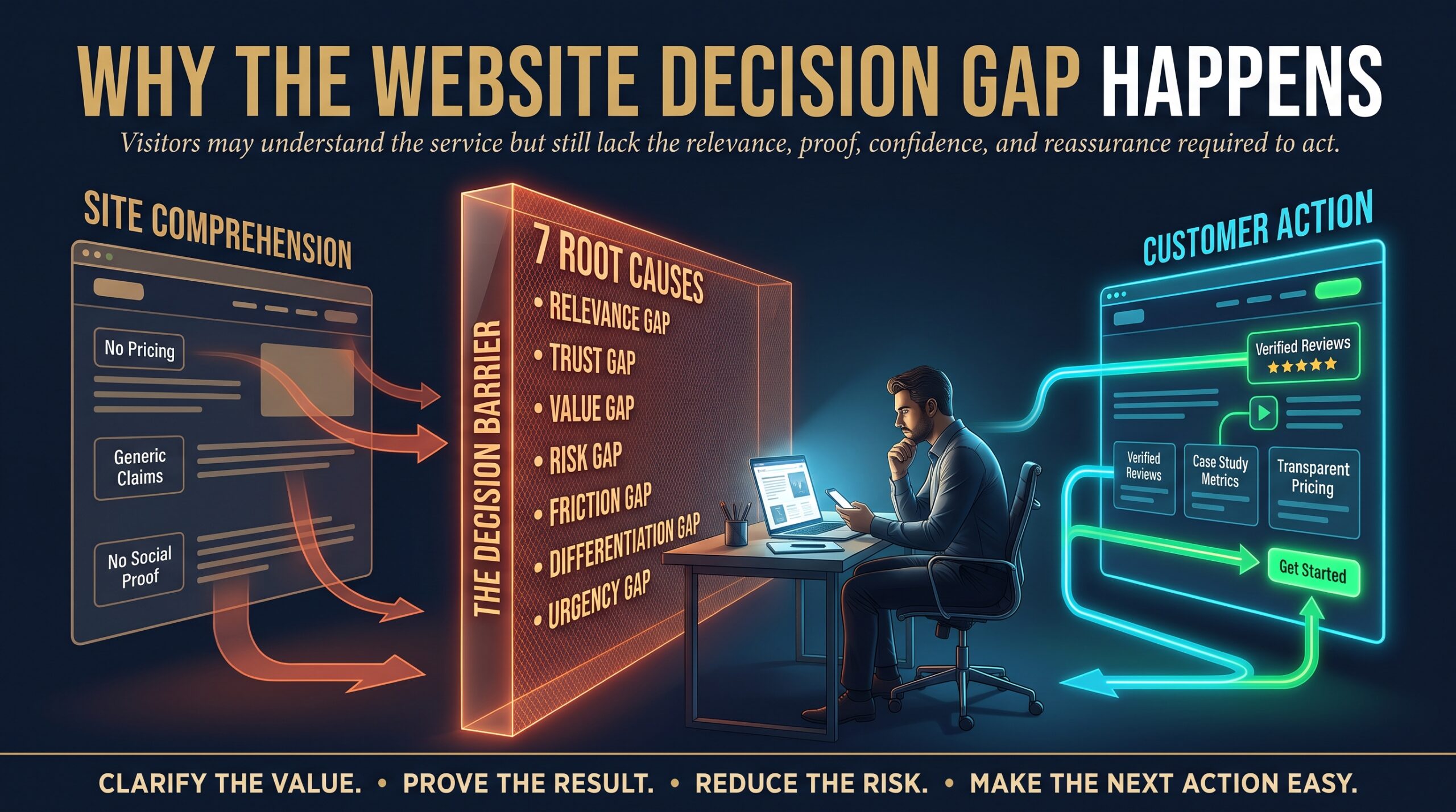
- They are not sure it is for them. Your page explains what you do, but not who it suits or whether it fits their situation.
- They fear the commitment. Contacting a business feels like the start of a sales conversation, which many people want to avoid.
- They lack proof. Without reviews, case studies or recognisable results, claims feel like marketing.
- Their questions go unanswered. Pricing, timeframes and process are the usual worries. If the page does not mention them, visitors assume the worst.
- The next step is unclear. Weak or buried calls to action leave people unsure what to do.
- The effort feels high. Long forms, slow pages and awkward mobile layouts make contacting you feel like work.
- There are too many choices. Several competing buttons and options create hesitation instead of action.
Signs You Have a Website Decision Gap
- Traffic is steady, but enquiries and calls are low compared with visits.
- Visitors view your service and pricing pages, then leave without any action.
- Form starts are common, but few forms are completed.
- People who do contact you ask basic questions your site could have answered.
- Mobile visitors rarely call or submit, even though most of your traffic is on phones.
- Customers say they “almost called” or “were not sure what happens next”.
The Real Cost of the Website Decision Gap
An unaddressed website decision gap quietly wastes your marketing budget.
- Wasted traffic. Every visitor you paid or worked to attract and failed to convert is lost.
- Higher cost per lead. The same spend produces fewer enquiries.
- Misleading decisions. You may blame the traffic source, the ads or the SEO when the real problem is on the page.
- Lost sales to competitors. Hesitant visitors often contact the next business that makes it easier.
In short, the website decision gap turns good visibility into missed opportunity.
How to Close the Website Decision Gap
You do not need a complete rebuild to start. These steps improve conversion rate optimisation by making the decision easier.
- Give each page one clear next step. Choose the main action, such as a quote request, call or booking, and make it the most visible call to action) on the page.
- Lower the commitment. Offer a small first step such as a free audit, a short consultation or a no-obligation quote so visitors do not feel they are committing to a purchase.
- Show proof close to the action. Place reviews, case studies, client logos or short results near your buttons. This kind of social proof reassures people at the moment of decision.
- Answer the real objections. Address pricing, timeframes, process and what happens after someone contacts you. A short FAQ on key pages helps.
- Explain what happens next. Tell visitors how quickly you reply and what the first conversation covers. Only state a response time you can keep.
- Shorten the form. Ask only for what you need to respond, such as name, contact details and a short message. Every extra field gives people a reason to stop.
- Make contact easy on mobile. Use tap-to-call buttons, large tap targets and a sticky call or quote button on small screens.
- Fix speed and usability. Slow pages and clumsy navigation erode confidence. Google’s Core Web Vitals are a useful guide to page experience, and good usability supports every other step.
- Offer more than one way to reach you. Some people want to call, some prefer a form, others want chat or email.
- Measure and test. Track calls, form submissions and button clicks, and review where visitors drop off. Change one thing at a time and compare results.
Mapping the Visitor’s Questions to Your Page
A simple way to find your website decision gap is to list the questions a hesitant visitor is silently asking, and check whether your page answers each one:
| Visitor’s silent question | What answers it | What to measure |
| Is this for someone like me? | Clear audience and industry examples | Time on page, scroll depth |
| Can I trust them? | Reviews, case studies, real contact details | Clicks on proof sections |
| What will it cost? | Price guidance or packages | Visits to pricing, then enquiries |
| What happens if I contact them? | Short “how it works” steps | Form starts and completions |
| Is it easy to reach them? | Tap-to-call, short form, chat | Calls and form submissions |
If a question has no answer on the page, that is a gap worth closing first.
Mistakes That Widen the Website Decision Gap
- Describing features endlessly without saying who the service is for or what result to expect.
- Hiding contact options in a footer or a single page.
- Using vague buttons such as “Submit” or “Learn more” instead of clear actions like “Get a free quote”.
- Asking for too much information too early.
- Redesigning the site for looks and never testing whether it produces more enquiries.
How a Web Development Company Can Help
Closing the website decision gap blends design, content, speed and measurement. Our team can help with:
- Web design and development with conversion-focused layouts and clear calls to action.
- WordPress development for fast, easy-to-edit websites.
- Shopify development and WooCommerce development for online stores that reduce friction.
- Webflow development for design-led marketing sites.
- Small business website development for growing companies that need a clear path to enquiries.
- Ecommerce website redesign and ecommerce SEO to improve both visibility and conversion.
Explore all of our web development services, including our ecommerce web services, or learn more about us.
Web Development Support in Your City
Whether your website decision gap is costing you local enquiries or national sales, we work with businesses across Australia:
- Web development company in Sydney
- Web development company in Melbourne
- Web development company in Brisbane
- Web development company in Adelaide
- Web development company in Canberra
- Web development company in Perth
See all of our locations, read the FAQs or browse the blog. Ready to talk? Get a free quote.
Frequently Asked Questions About the Website Decision Gap
What is the website decision gap?
It is the gap between a visitor understanding what your business does and deciding to contact you. The message is clear, but something about trust, effort or the next step stops them from acting.
Why is my website getting traffic but no enquiries?
Common reasons include unclear calls to action, missing proof, unanswered questions about price and process, long forms, slow pages and a poor mobile experience.
How do I get more people to contact me from my website?
Give each page one clear next step, add reviews and case studies near your buttons, answer common objections, shorten your form and make calling easy on mobile.
How many fields should a contact form have?
As few as you need to respond properly. Name, contact details and a short message are enough for most businesses. You can ask for more detail in the follow-up.
Do I need a new website to fix the website decision gap?
Not always. Many improvements, such as clearer calls to action, better proof and a shorter form, can be made on your existing site. A redesign helps when speed, structure or mobile experience is the main problem.
Final Thoughts
The website decision gap is a reminder that understanding is not the same as deciding. People can fully grasp what you offer and still hesitate if they are unsure, worried about commitment or faced with extra effort. Make the next step obvious, reassure with proof, answer the real questions and remove friction, and more of your visitors will become enquiries.
Want a website that turns understanding into action? Request a free quote and let us review where your visitors are dropping off.