
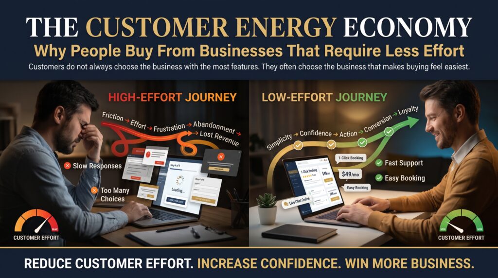


Customer effort is the quiet force behind most buying decisions, and most businesses never measure it. Think about the last time you abandoned an online order. Nobody insulted you and nothing actually broke. The form asked for one thing too many, the page took a beat too long, or you could not tell what would happen next. You did not decide against the product. You simply ran out of energy.
That idea sits at the heart of what we call the customer energy economy. Every visitor arrives with a limited budget of attention and patience, and every click, field and unanswered question spends some of it. Businesses that demand less customer effort win more enquiries, more sales and more repeat custom. This guide shows where customer effort hides on a typical Australian business website, and how a web development company can help you take it out.
What Is the Customer Energy Economy?
The customer energy economy is a simple way of looking at buying behaviour. People are not only weighing price and quality. They are also weighing how hard it is to get what they want. If two businesses offer a similar result, the one that feels easier almost always wins, even when it is slightly more expensive.
Customer effort comes in four forms, and a website can trigger all of them within a few seconds.
| Type of effort | Example on a website | What the visitor thinks |
| Thinking effort | Vague headline, ten menu options, jargon-heavy copy | “What do they actually do?” |
| Physical effort | Too many clicks, tiny mobile buttons, long forms | “This is a hassle.” |
| Waiting effort | Slow page loads, delayed replies to enquiries | “I will try someone else.” |
| Emotional effort | No pricing hints, no reviews, unclear next steps | “Is this safe? What is the catch?” |
Why People Buy From the Easier Business
Usability researchers have been saying this for years. The Nielsen Norman Group’s guidance on minimising cognitive load explains that people have a limited amount of mental processing power, and every extra decision draws it down. When a page asks too much, visitors do not push harder. They leave.
Three well-known ideas explain why lower customer effort converts better.
- Cognitive load: every extra element, option or instruction competes for the same limited attention.
- Hick’s Law: the more choices you present, the longer people take to decide, and the more likely they are to postpone the decision altogether.
- Decision fatigue: after several small decisions, people default to the easiest path, which is often doing nothing.
Australian shoppers have also been trained by easy experiences elsewhere. One-tap wallets such as Apple Pay and Google Pay, saved addresses and buy-now-pay-later options like Afterpay have set the standard. If your website asks for more effort than a major retailer does, visitors notice, even if they cannot say why.
Customer effort has an official measurement too. The Customer Effort Score, popularised by research from the Corporate Executive Board (now part of Gartner), asks customers how easy it was to get what they needed. Its core finding is useful for any business: reducing effort is a stronger driver of loyalty than trying to impress people.
Where Customer Effort Hides on Your Website
Most owners are too close to their own site to see the friction. These are the seven places we find it most often.

1. An unclear homepage
If a first-time visitor cannot tell what you do, who it is for and what to do next within a few seconds, they have to work it out. Most will not. A clear headline, one sentence of proof and one obvious button beat a clever slogan every time. Our post on website first impressions looks at how quickly people form that judgement.
2. Slow pages
Waiting is effort that people cannot even control. Google’s Core Web Vitals guidance gives clear targets for loading speed, responsiveness and visual stability. We break these down in plain English in Core Web Vitals explained.
3. Complicated navigation
Menus with a dozen top-level items force a decision before the visitor has even started. Group services logically, use plain labels, and make sure your most valuable page is never more than two clicks away.
4. Long forms and unnecessary fields
Every field you add lowers the chance of a submission. Ask for the minimum you need to start the conversation. A name, an email and a short message often outperforms a ten-field form that feels like paperwork.
5. Checkout friction
Forced account creation, surprise shipping costs and unclear delivery dates are the classic effort traps. The Baymard Institute’s checkout usability research documents how these small frustrations add up to abandoned carts.
6. Poor mobile experience
On a phone, effort multiplies. Tiny tap targets, pop-ups that cover the content and forms that fight the keyboard all drain patience quickly. A mobile-first build is not a nice extra. It is the baseline.
7. Uncertainty and missing trust
Emotional effort is the hardest to spot. When visitors cannot find reviews, contact details, pricing guidance or a clear process, they have to guess, and guessing is tiring. We cover this in more depth in why websites lose trust.
| Effort leak | Quick fix | Where we help |
| Unclear homepage | One headline, one proof point, one button | Web design and development |
| Slow pages | Compress images, clean code, better hosting | Performance optimisation |
| Heavy navigation | Fewer, clearer menu labels | Website redesign |
| Long forms | Cut fields, add inline help | Lead generation setup |
| Checkout friction | Guest checkout, wallets, clear delivery info | Shopify and WooCommerce |
| Weak mobile UX | Bigger tap targets, simpler layouts | Mobile-first development |
How to Measure Customer Effort
You cannot reduce what you do not measure. The good news is that most of the data already exists.
- Customer Effort Score survey: ask one question after a purchase or enquiry, such as “How easy was it to get what you needed today?”
- Google Analytics 4: look at funnel steps, exit pages and form completion rates to see exactly where people quit.
- Session recordings and heatmaps: tools such as Microsoft Clarity show where people hesitate, rage-click or scroll past key content.
- Core Web Vitals: check loading, interaction and layout stability in Google Search Console.
- Support and sales questions: the questions people ask repeatedly are the places your site failed to answer.
Seven Signs Your Website Has a Customer Effort Problem
- Plenty of traffic but very few enquiries or sales.
- High abandonment on forms, carts or booking pages.
- Sales teams keep answering the same basic questions.
- Mobile conversion rates are far lower than desktop.
- Visitors bounce from service pages within seconds.
- Customers phone to ask things your site should already explain.
- Competitors with weaker products still get more enquiries.
If three or more of these sound familiar, customer effort is probably costing you more than your marketing budget is bringing in.
A 30-Day Plan to Lower Customer Effort
- Week 1, find the friction. Review analytics, record real sessions and list the five pages where most visitors drop out.
- Week 2, simplify the first screen. Rewrite the homepage and top service pages so the offer, proof and next step are obvious in seconds.
- Week 3, shorten the path. Trim form fields, reduce menu items, add guest checkout and make every key action possible in one or two taps on mobile.
- Week 4, test and repeat. Compare enquiry and conversion rates against the previous month, then move on to the next five pages.
Low-Effort Ecommerce: Shopify, WooCommerce and Checkout Design
Online stores feel customer effort more sharply than any other type of website, because the cost of friction is measured in lost orders. A well-built store makes the product easy to find, the price easy to understand and the payment easy to finish.
Our ecommerce agency services cover Shopify development services, WooCommerce development and WordPress development services, plus ecommerce website redesign for stores that have outgrown their original build. If you are a smaller operator, our small business website development option keeps things lean, and ecommerce SEO helps the right buyers find you in the first place. For custom brochure sites and applications, see web design and development.
Web Development Support Across Australian Cities
Whether you serve one suburb or the whole country, an easier website helps you stand out in a crowded local market. We support businesses in every major capital.
- Sydney: web development in Sydney for competitive markets where a faster path to enquiry makes the difference.
- Melbourne: web design and development in Melbourne for service businesses, retailers and growing ecommerce brands.
- Brisbane: website development in Brisbane for trades, healthcare, tourism and professional services.
- Perth: web development in Perth for resources, engineering and fast-growing local businesses.
- Adelaide: website development in Adelaide for manufacturing, education and small business owners.
- Canberra: web development in Canberra for government suppliers, consultants and compliance-focused sites.
You can see the full list on our locations page or explore all web development services.
Frequently Asked Questions About Customer Effort
What is customer effort in website design?
Customer effort is the amount of thinking, clicking, waiting and worrying a visitor must do to reach their goal on your website. The lower it is, the more likely they are to enquire or buy.
How do I reduce customer effort on my website?
Start with clearer messaging, faster pages, simpler navigation and shorter forms. Then fix mobile usability and remove friction from checkout or booking flows.
What is a good Customer Effort Score?
Scores vary by scale and industry, so track your own trend over time. The goal is a steady move towards “very easy” across the pages and journeys that matter most.
Does website speed affect customer effort?
Yes. Waiting is one of the most frustrating forms of effort, and slow pages also hurt your Core Web Vitals and search visibility.
How much does it cost to make a website easier to use?
It depends on scope. Some fixes, such as shortening forms or rewriting headlines, are quick. A full redesign or checkout rebuild is a larger project. A free audit is the best way to get an accurate figure.
Final Thoughts: Make Choosing You the Easy Option
Customer effort is invisible until you look for it, and then you see it everywhere. The businesses that grow are rarely the loudest. They are the ones that make the next step feel effortless. Reduce customer effort and you will not need to push so hard to win customers.
Want to find out where visitors are running out of energy on your site? Request a free website audit or call 1300 649 299 and our team will map the fixes for you.